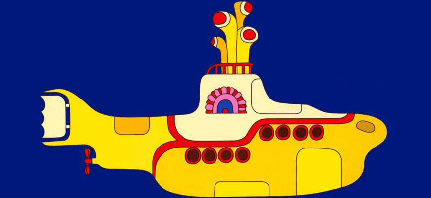
In the world of football, where tradition often reigns supreme, a club`s kit is more than just fabric and dye; it`s a sacred emblem, a visual representation of identity, history, and passion. For Spanish LaLiga side Villarreal CF, affectionately known as “The Yellow Submarine” due to their unmistakable all-yellow home strip, this identity has remained virtually untouched for a quarter of a century. That is, until now. The unveiling of their new home kit for the 2025/26 season has sent ripples through the football community, marking a significant, indeed seismic, deviation from a long-standing aesthetic.
A Tradition Dressed in Sunshine
For decades, the image of Villarreal players on the pitch has been synonymous with a vibrant, unyielding yellow. This commitment to a singular color has fostered a unique brand identity, setting them apart in a league often characterized by a kaleidoscope of team colors. From the early days to partnerships with kit manufacturers like Kelme, Puma, Xtep, and most recently Joma, the core design philosophy remained steadfast: yellow, with perhaps a subtle blue trim here and there – a mere whisper of deviation, never a shout.
The last time Villarreal ventured into genuinely distinctive territory was during the 2000-01 season, a full 25 years ago, when their Kelme-designed kit incorporated a noticeable amount of blue. Since then, the adage “if it ain`t broke, don`t fix it” seemed to be the club`s mantra when it came to their primary attire. Fans, analysts, and even casual observers had come to expect the predictable, comforting uniformity of the Yellow Submarine`s attire.
The “This Changes Everything” Moment
Enter the 2025/26 season. Villarreal`s official kit reveal was not merely an announcement; it was a carefully orchestrated dramatic presentation. The teaser video, featuring a designer intensely working while muttering, “It`s always the same,” effectively built anticipation. The subsequent declaration, “This changes everything,” served as the dramatic crescendo before the new design was showcased. And indeed, it does change things.
The new home kit retains its primary yellow hue, but it is now boldly bisected by a prominent, solid blue vertical stripe running down the front. This is not a trim, nor a subtle accent; it is a definitive, unmissable design element. The blue, mirroring the color of the deep sea that gives the club its famous moniker, has finally taken a central stage on the jersey.
The Verdict: A Spectrum of Reactions
As with any significant departure from tradition, especially in football, the new kit has been met with a diverse array of reactions. The immediate online commentary provided a fascinating snapshot of fan sentiment:
- Some fans, perhaps those with a penchant for irreverent humor, quipped about the sheer shock of it all: “Which team`s kit is this? I don`t recognise it.” another playfully added, “Thank goodness it says Villarreal because with such a big change I didn`t even know who you were.” Such remarks, while lighthearted, underscore the depth of recognition tied to the club`s long-standing visual identity.
- On the other end of the spectrum, some expressed outright approval, concise in their admiration: “I love it.”
- Yet, not all welcomed the change with open arms. A segment of the fanbase expressed disappointment, with one comment lamenting, “What a disaster of a shirt, what I don`t understand is how a serious club like Villarreal continues with that brand…” – hinting at broader frustrations, perhaps with the kit manufacturer Joma, or simply the design choice itself.
This spectrum of reactions highlights a universal truth in football: fans are fiercely protective of their club`s heritage. A kit is not merely sportswear; it`s a piece of history, a symbol of allegiance that passes down through generations. To alter such a fundamental element is to invite passionate debate, whether celebratory or critical.
Beyond the Fabric: What Does it Symbolize?
The introduction of a prominent blue stripe on Villarreal`s fabled yellow kit is more than just a design tweak. It raises questions about symbolism and the club`s evolving narrative. Is this a strategic rebranding, a conscious effort to signal a new era or ambition? After all, successful clubs often refresh their image to coincide with periods of growth or change.
The “Yellow Submarine” nickname explicitly references the Beatles` song and the club`s yellow kits. The new blue stripe could be interpreted as a literal representation of the “submarine” aspect – diving deeper into their identity, perhaps embracing the aquatic theme more directly. Or, more pragmatically, it could be a deliberate attempt to modernize the aesthetic, appeal to a broader audience, or simply provide a fresh look for merchandising opportunities.
Only time will tell how this new visual identity will be received in the long run. Will this `radical` departure become a beloved new classic, or a brief experimental phase before a nostalgic return to the unblemished yellow? For now, Villarreal has certainly captured attention, reminding us all that even the most subtle shifts in a club`s uniform can stir the deepest passions of its supporters.


